Case study
News UK
A data analytics dashboard to connect News UK to key insights faster
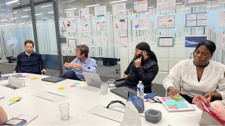
Our workshops with News UK surfaced a huge number of insights about the team’s frustrations, experiences, and ideals that informed the dashboard we developed
News UK’s analytics dashboard held a huge amount of useful data, but many newsroom staff found it difficult to use. After a week embedded with journalists and editors in London and three rounds of prototyping, people who had stopped using the old tool were asking when they could get the new one.
Every morning, News UK editors gather in a conference room to review the latest performance report. Across the newsroom, wall-mounted screens show how stories are performing.
The data behind those moments came from TED, News UK’s internal analytics dashboard. Some staff valued its depth. Others found it overwhelming and had stopped using it altogether.
Quick facts
News UK redesigned its newsroom analytics as three branded dashboards built on one shared design system. The designs span desktop, mobile, a Chrome extension and large newsroom screens. In final user testing, staff who didn’t use the existing tool were asking when they could start using the new one.
- Client: News UK
- Industry: Media and publishing
- Services: UX research, workshop facilitation, UX/UI design, prototyping, user testing and design systems
Making deep data useful to more people
News UK publishes The Times, The Sunday Times and The Sun, and broadcasts talkSPORT. Each brand measures success differently, with its own metrics, visualisations and ways of working.
TED had been designed around the needs of data specialists. News UK wanted to keep that depth, while making the data easier for journalists, editors and analysts to understand and act on.
The ambition was significant: News UK wanted 80% of the newsroom using the new tool at rollout.
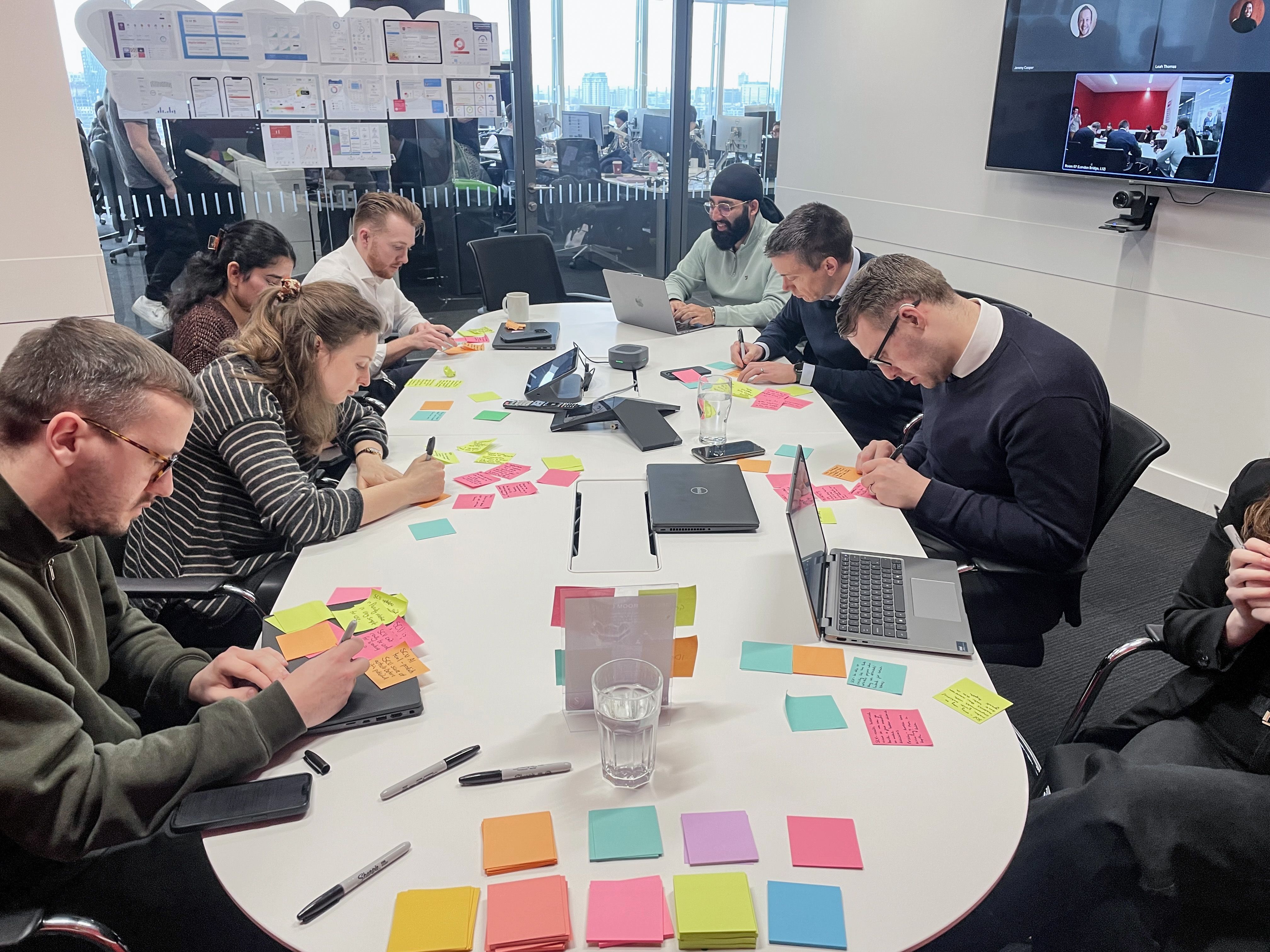
Our workshops with News UK surfaced a huge number of insights about the team’s frustrations, experiences, and ideals that informed the dashboard we developed.
A week inside the newsroom
To understand how people actually used data, Airteam’s Head of UX, Nick Simpson, spent a week working inside News UK’s London newsroom.
Almost 20 workshops brought together around 100 journalists, editors and analysts. But just as important was seeing where the product fitted into their working day: the morning conference room, the screens around the newsroom, the devices people used and the distances they viewed information from.
“The week on site was integral to this working, because it really gave me that immersion into how everyone worked,” says Nick. “I knew where that conference room was - that everyone rushed to every morning to see that report.
“I knew where the TV screens were placed. I knew how far away people were when they looked at them, and I met the teams and understood, not just their frustrations and how they worked, but their personalities – who they were as people.
“Forming those kind of connections with them, really helped to deeply understand who they were and what their needs were – whether spoken or not.”
This kind of research is known as contextual inquiry: understanding people’s needs in the environment where the work actually happens.
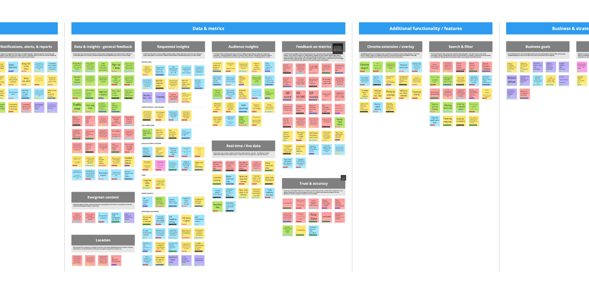
The workshops feedback was organised into key themes that guided design.
From all those conversations, three priorities kept surfacing.
Personalisation: people wanted to see the information that mattered to their role, rather than everything at once.
Active insights: they wanted clear signals about how content was performing, with useful recommendations about what to do next.
Brand-specific metrics: each masthead needed to reflect the measures its editors actually use to make decisions.
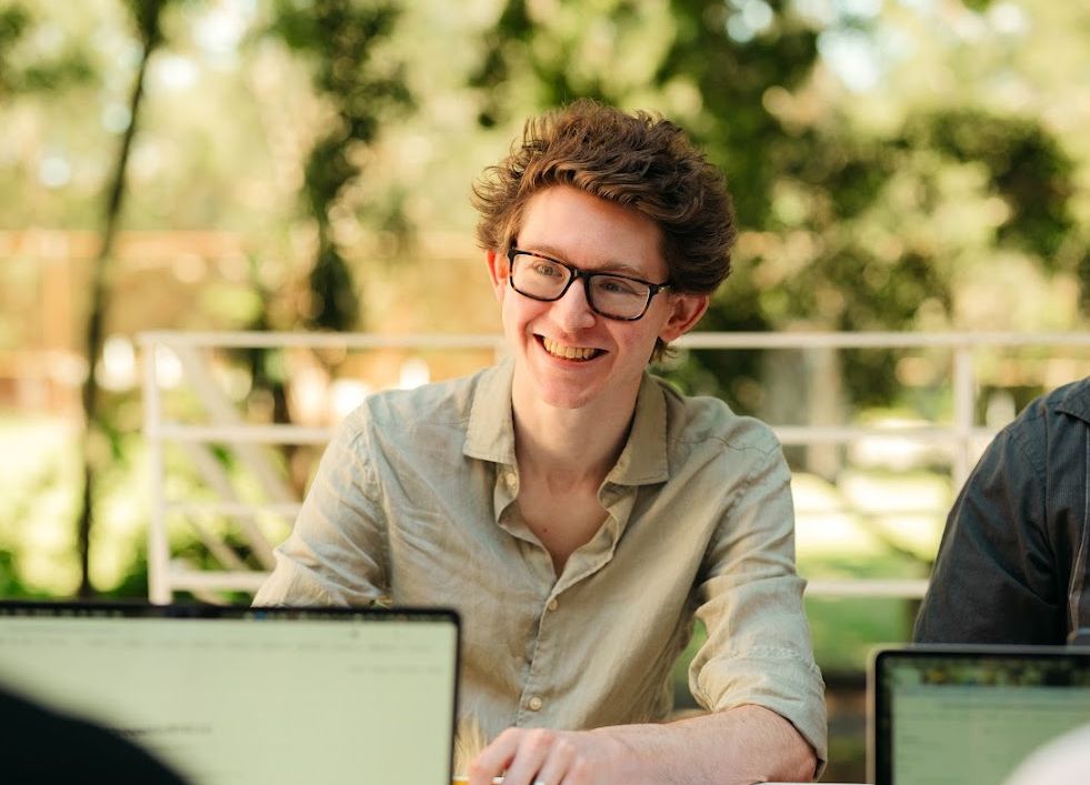
Nick Simpson, our Head of UX, spent a week onsite in News UK’s news room. He says it was imperative to maintain a regular feedback loop, test, and refine.
Designing for the other side of the room
A dashboard might be viewed on a laptop, checked quickly on a phone or displayed on a screen several metres away.
That changes how you design it.
Seeing News UK’s wall-mounted screens in context helped determine type sizes, layout density and which metrics deserved space on the large-screen view. Information that works perfectly at arm’s length can become useless from across a newsroom.
The principle is simple: before designing a dashboard, understand where people will actually read it, what they’ll read it on and how much attention they’ll be able to give it.
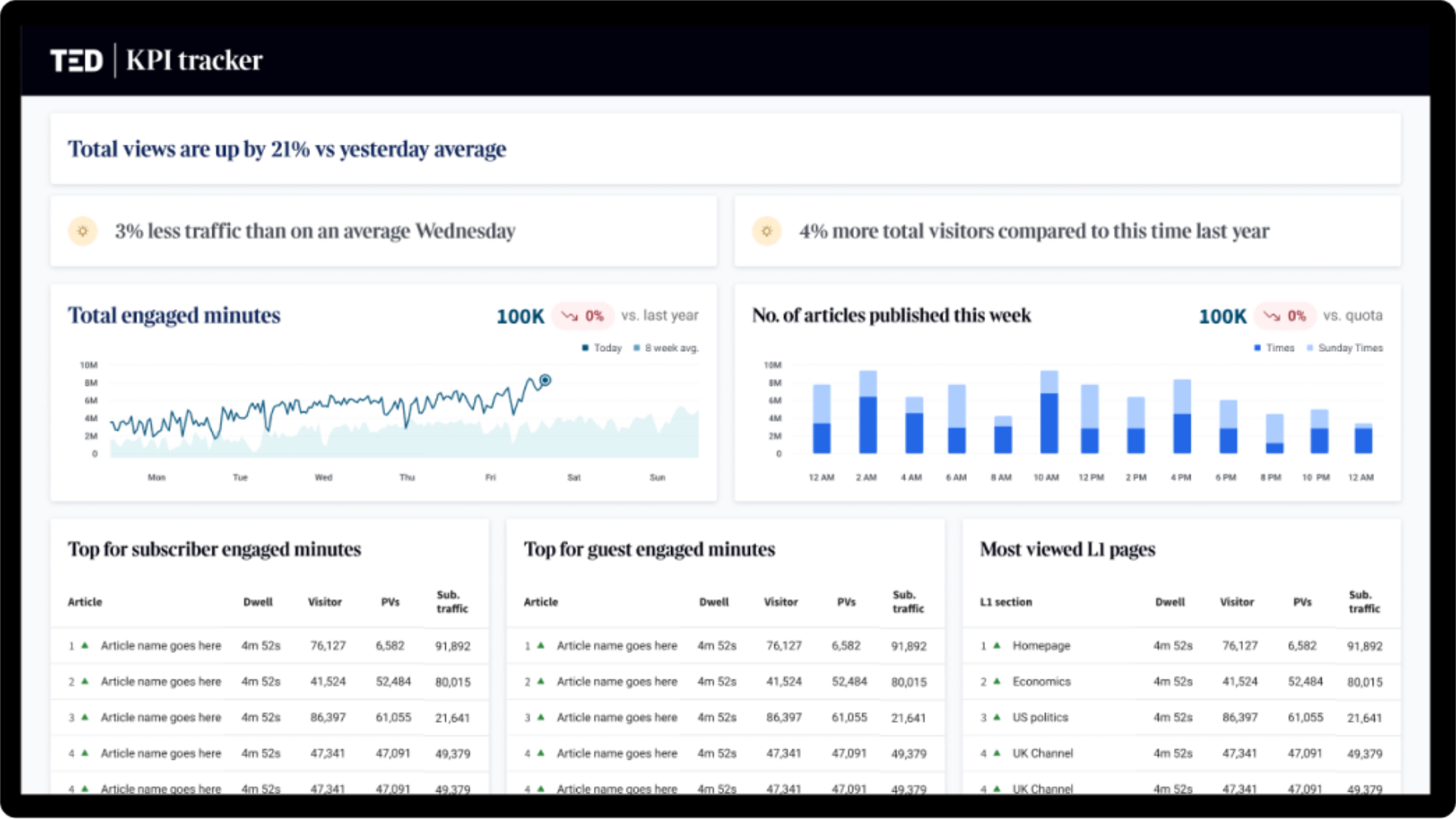
We got to see the big TVs the newsroom relies on for pulse checks on news performance. This informed our dashboard design.
From sketches to branded screens
Rather than jumping straight into polished interfaces, we built the dashboards up in stages.
Simple sketches let us test whether the right information was in the right place. Clickable prototypes added real interactions that could be put in front of newsroom staff. Only once those foundations had been tested did we move into high-fidelity designs for each masthead, adapted across desktop, mobile, a Chrome extension and large newsroom screens.
After the week in London, twice-weekly remote sessions kept that feedback loop moving. The Sydney–London time difference actually helped.
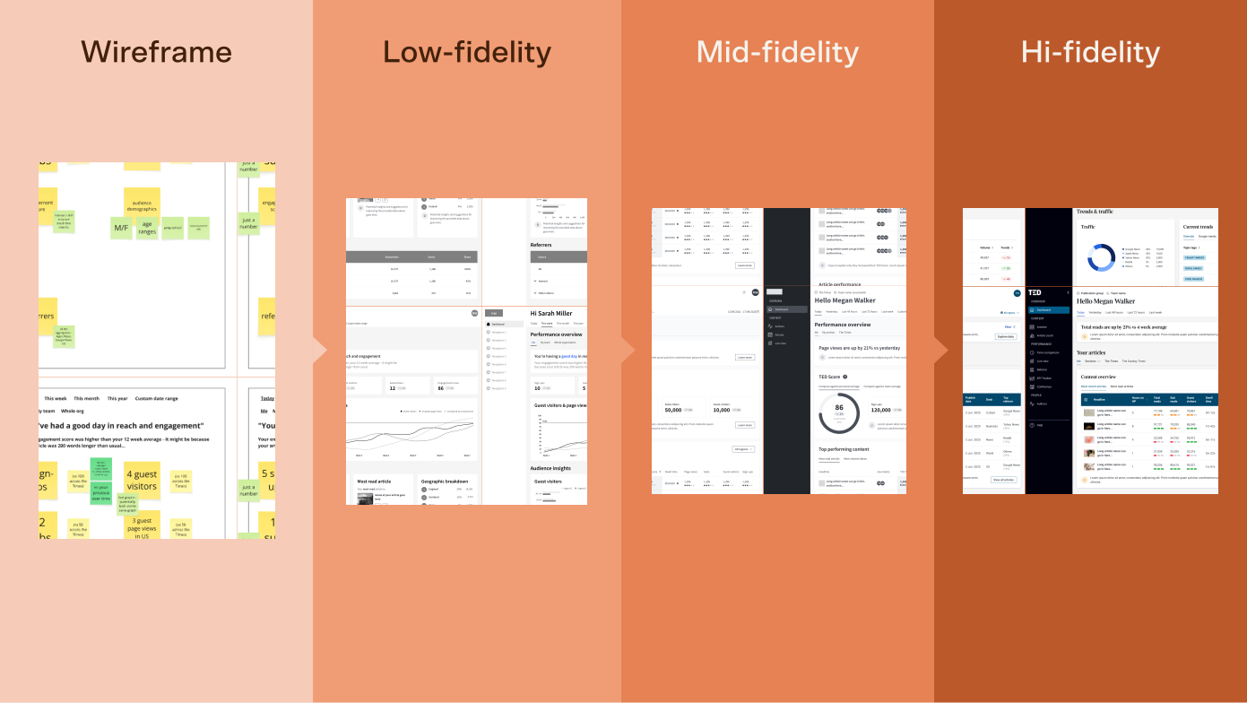
Airteam’s LUMA-certified experts specialise in human-centred design, which unlocks simple and elegant solutions for complex projects.
One system behind three different brands
The Times, The Sunday Times and The Sun each needed a dashboard that felt like its own product. Maintaining three entirely separate interfaces, however, would create unnecessary work for News UK’s designers and developers.
Instead, we created one design system of shared components that could adapt to each masthead’s branding and requirements.
News UK’s designers could work from the same foundation, while developers could reuse components across brands rather than rebuilding the same patterns three times.
“It’s just this consistent language that you can use across each brand,” says Nick.
The result is consistency underneath, without asking three very different mastheads to look or behave exactly the same.
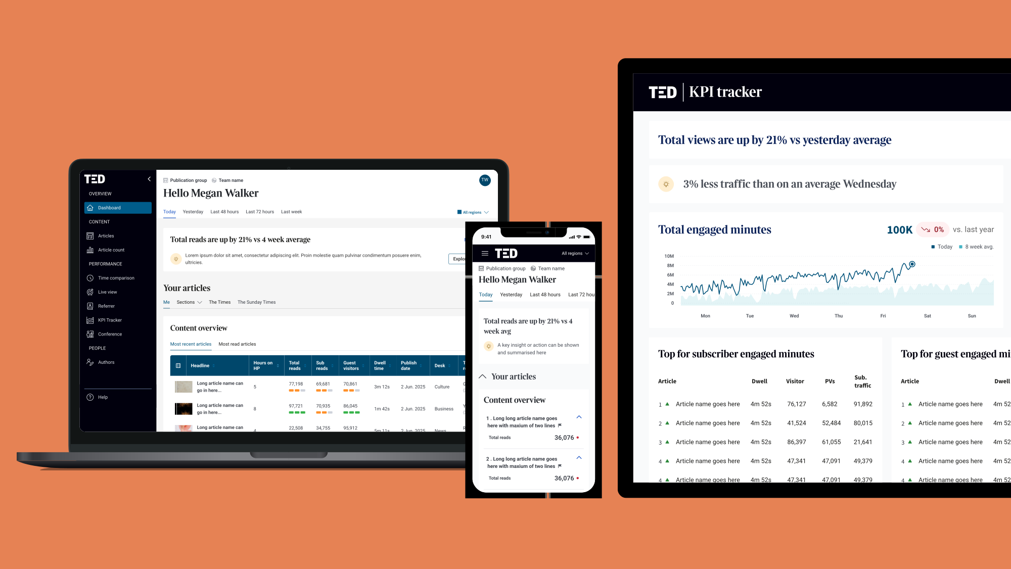
The dashboard displayed on multiple devices.
“When can I get this?”
The clearest test came in the final round of user testing.
Some of the participants were people who had stopped using TED because they found it too difficult. This time, their response was different.
“I think success was achieved when we did our last round of user testing, and a few of them just said, ‘When can I get this?’” says Amaritpal Saini, Data Product Manager at News UK. “And these are people that don’t use the current tool because they find it too tricky.”
The project left something else behind, too. News UK’s team had been part of the research and design process throughout, picking up methods they could continue using themselves.
“There are a lot of frameworks we learned off of him as well,” says Amaritpal, referring to Nick’s approach to research synthesis.
For a product designed to make data more accessible, perhaps the best result was a simple one: people who had stopped looking at the data wanted to come back.
News UK by the numbers
~100
Newsroom staff consulted
3
Branded dashboards
4
Formats: desktop, mobile, Chrome extension & newsroom screens
1
Shared design system